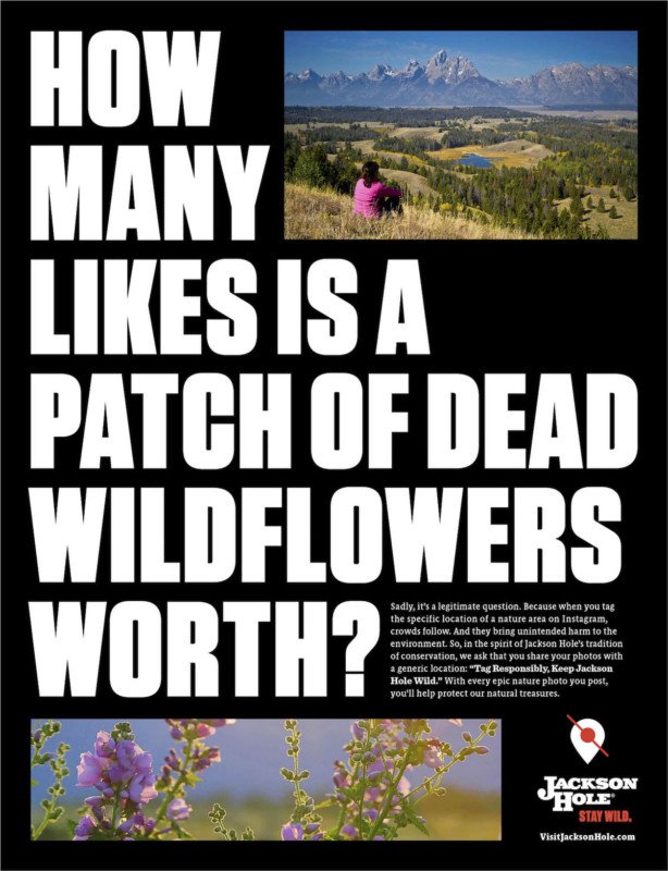
To Tag or Not to Tag. That may be the Question.

Photo Via Petapixel
If you follow my posts on this blog, you probably noticed that I do a fair amount of hiking. We generally visit two national parks or national park-like areas each year. At each location we spend between one or two weeks.
Prior to our trip, we plan the trails and vistas we would like to see. There are often sights that are iconic and of course we like to visit them and take some photographs for our collection. Often, however, we are way off the beaten path when we see some stunning and perhaps more pristine areas.
I have often discussed the idea of keeping these areas as natural as possible with as little human impact as feasible. After all, this is the home of the native flora and fauna.
The negative aspects of tagging photographs with exact geographic locations has been debated for a number of years. The video below – created by Jackson Hole, Wyoming – highlights the seriousness of this problem.
Personally, I don’t use specific tags with my photographs. I may include a general location such as the name of the National Park, City or State, but that is all.
What are your thoughts.
**********
See more photography posts HERE and visit Jeff’s Instagram site HERE
**********
All original content on this blog is copyrighted by Jeffrey B. Ross with ALL Rights Reserved. While reference links back to JBRish.com are appreciated and encouraged, please acquire approval for any reproduction of original content from this website.
©Jeffrey B. Ross 2014 – 2018 – JBRish.com
